Demo Day for our Winter 2018 batch is a week from today. We’re largely focused on preparing companies for their on-stage presentations, but are also working with them on slightly longer decks to use in follow-up conversations with investors.
I’ve written about pitching before, and realized that what we were missing was a clear template for how founders should lay out their stories through slides. The deck below is a template for how I think companies should build seed decks. While the main target for this template is a company raising its seed round, the deck is not all that different from best practices for a Series A deck - which we’ll release next.
The key point to remember here is that founders should strive for clarity and concision. This is not the right place to write a treatise on your market or world philosophy. The simple truth is that there isn’t very much meaningful detail to explore for most seed stage companies. When founders pretend that there is, their stories get muddled, and the investors get lost.
Focus on narrative. The rest is commentary. (see footnote)
Here's the template on Google Drive.
This is the title page. It has the name of your company, and a one line description of what you do.
This is the only place in the deck where you can only have 1 slide for what you need to show. Any of the other slides in this deck should be treated as a first slide of a set. If you can keep the set to n=1, that’s ideal, but if you need more, that’s ok. You probably don’t want any set here where n > 3. This is a seed deck, remember.
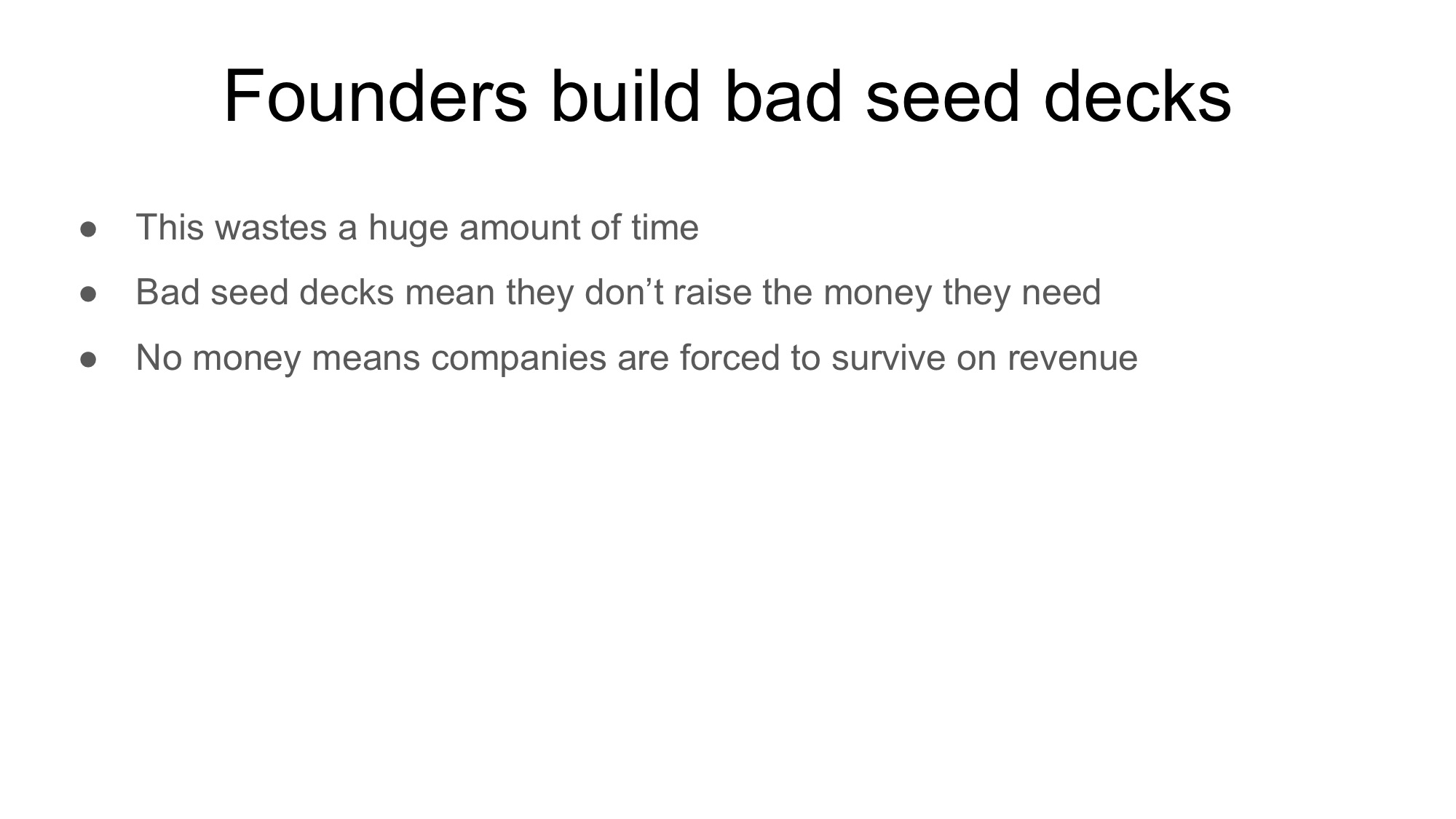
This is where you clearly state the problem. Particulars of how this problem impacts real world people/businesses are valuable.

This is the solution. You want to explain what you do very clearly, in as few words as possible. Describe the concrete benefits you provide
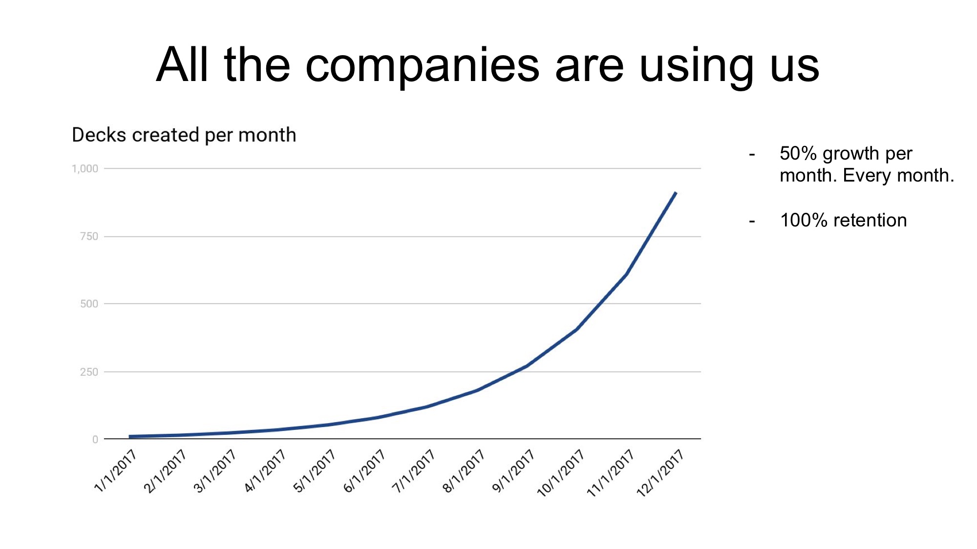
Show off your traction (if you have it). Make the numbers clear and meaningful. It’s unlikely your curve will be this smooth. That’s ok.
Add some context next to the chart if you’ve got some great stats you want to add.
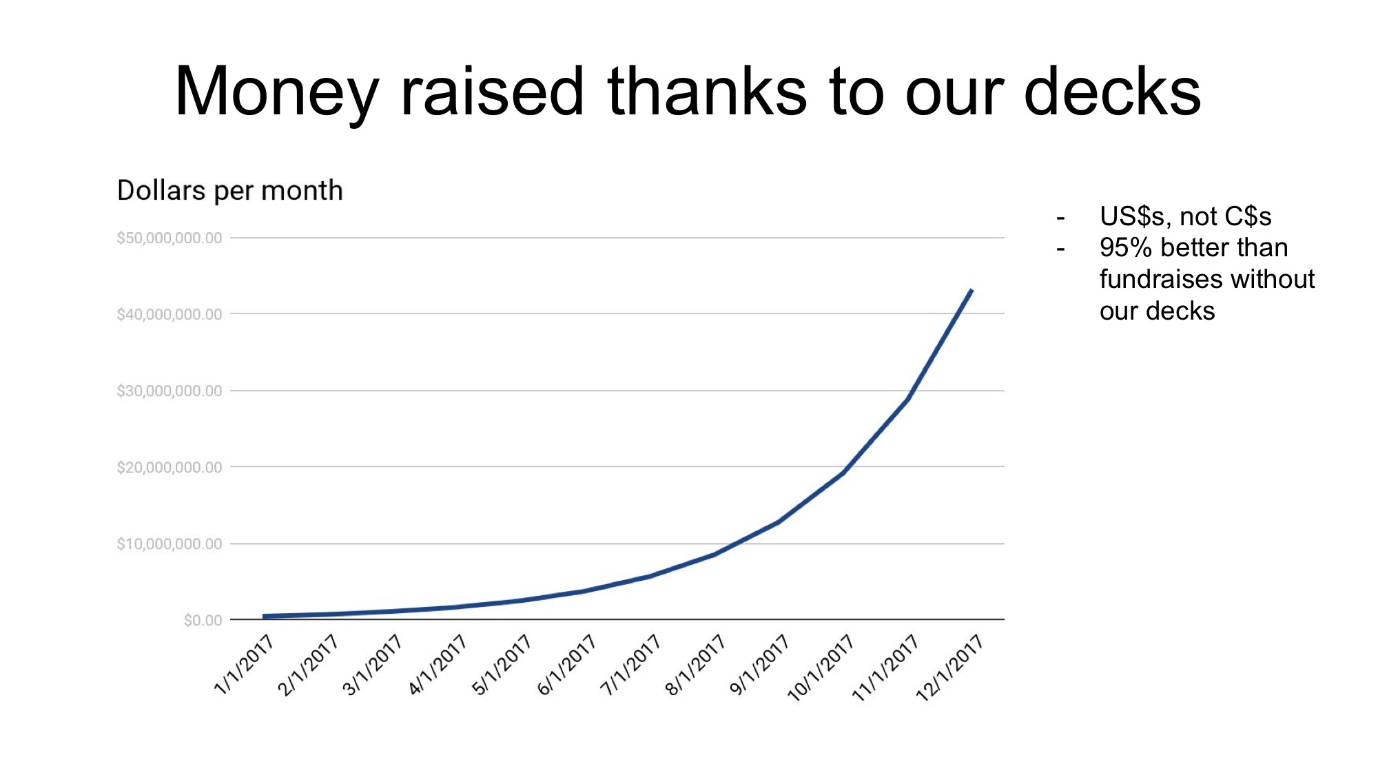
Got more metrics? Awesome! Add them!
Trick slide! Revenue would be better here, but this is ok.
Tell the investor what makes you so special, what makes this work, what your insights are. This might take more than one slide.
Business model is important. You probably don’t know all the details yet, but you should know a lot of them. Lay it out. If you need more space to dig into something complicated, add slides.
What’s the market here? Is it going to be big? Will you make it big? How much money are you going to make off this thing? Convince the investor that they’re going to make lots of money with you
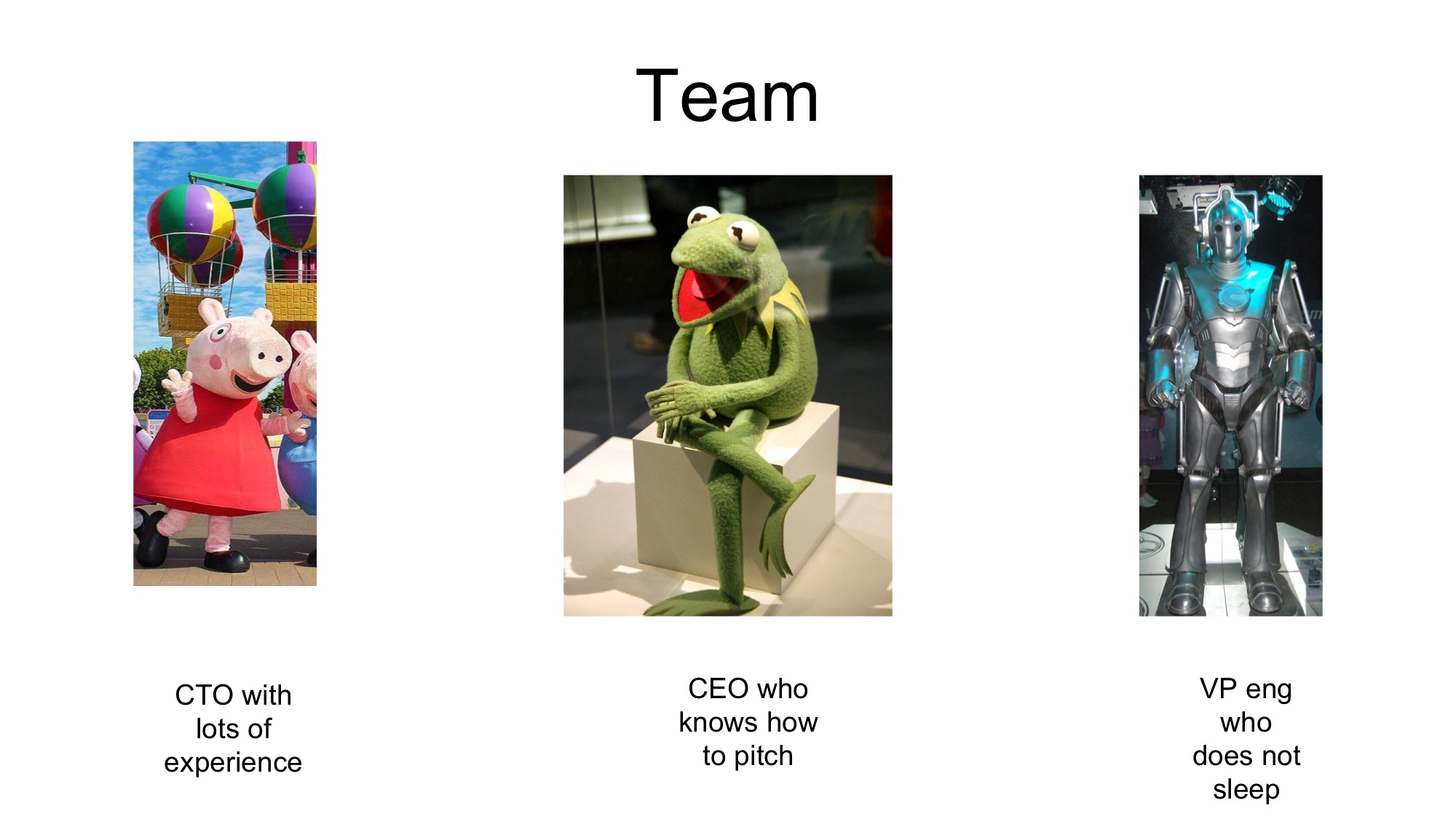
Team! So important at seed. Talk about what makes your team particularly well suited to the problem. This should be about founders. Nobody cares about your advisors.
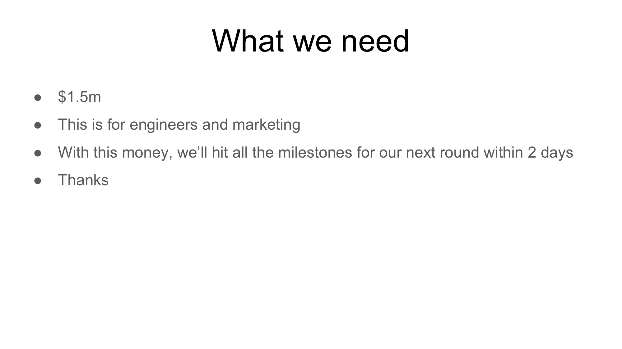
Tell the investor how much money you need, and what it gets you. If you can lay out where you’ll be inside of a year, which should make you Series A ready, that’s powerful
footnote: This deck is intentionally simple in design. Kevin Hale wrote a great piece about how to design decks well.


0 Comments